Reading While Distracted
A Deep Dive into How to Create Engaging + Accessible Text Layouts
We all agree that we are besieged by content and that we have less time to read it all. In addition to having access to more information now then ever in the history of time, our attention spans have been impacted by the expectations of social media (Read: significantly shortened!).
The net result? Focusing for extended periods of time to read dense content is increasingly difficult. Who is impacted by this? The reader who struggles to consume sufficient information for their livelihood or personal interests as well as the thought leaders and scholars who are investing their life’s work in creating content to influence the ways we live, work, and do business.
OK, what can we do to assist the reader in dealing with this environment of “peak content”?
The Skimmers
I’ve already written about the skimmers. We are all skimmers, who dive in and out of text hoping to glean sufficient understanding. How can we help skimmers if this is indeed the new way we ingest content, due to the pressures on our time and attention spans?
The most important means for making text “skimmer friendly” is to establish different points of entry into the content.
Start Developing Skimmable Content!
The bad news is that the content tidal wave has not yet even crested. The good news is that we have tools to help us remain afloat. Are Authors, Editors, and Publishers willing to invest in ensuring their content is accessible to everyone by writing plainly and using points of entry? That remains to be seen. What is certain is that the ones that do will be the ones to make it back to dry land.
What do you think?
Examples of Points of Entry:
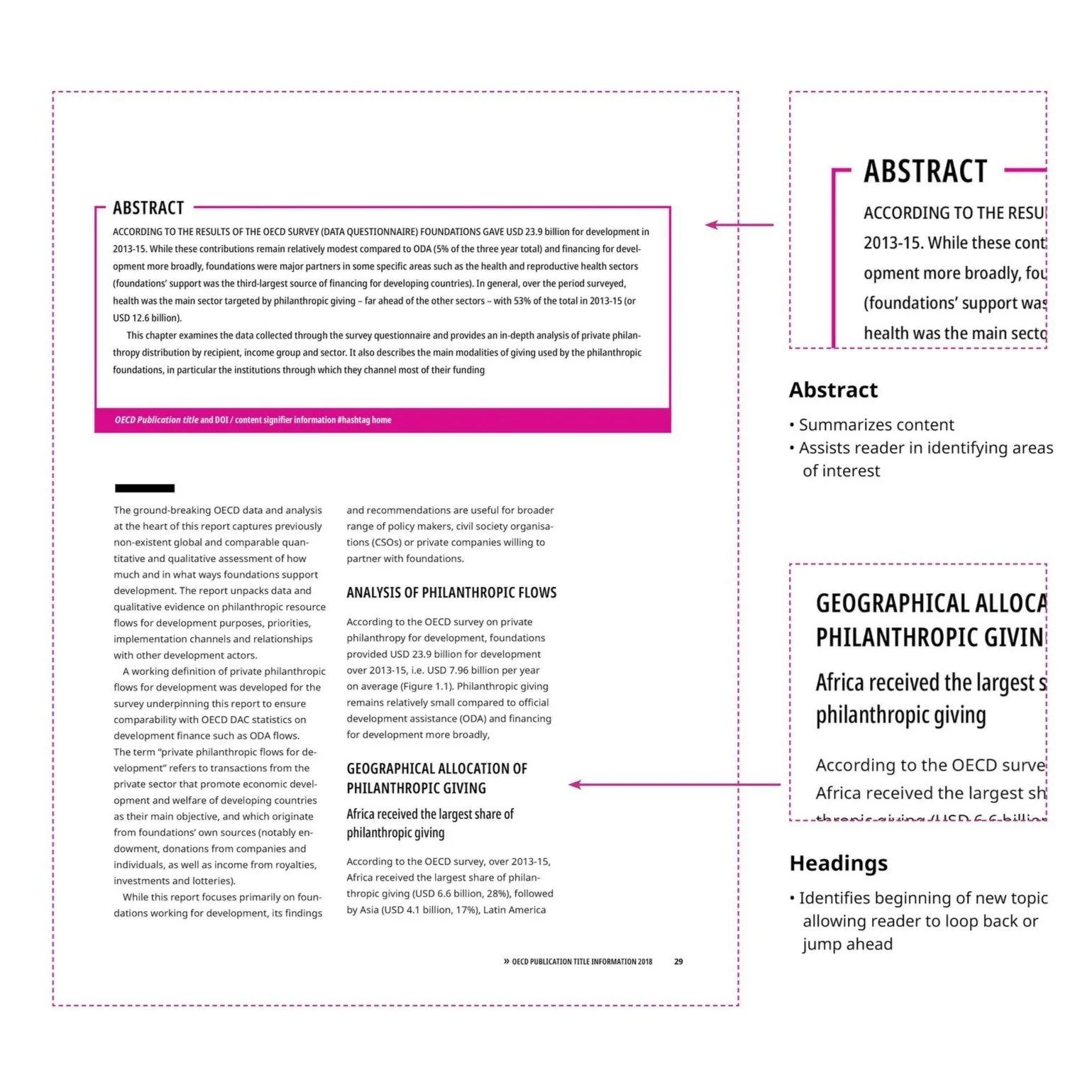
Summaries or abstracts
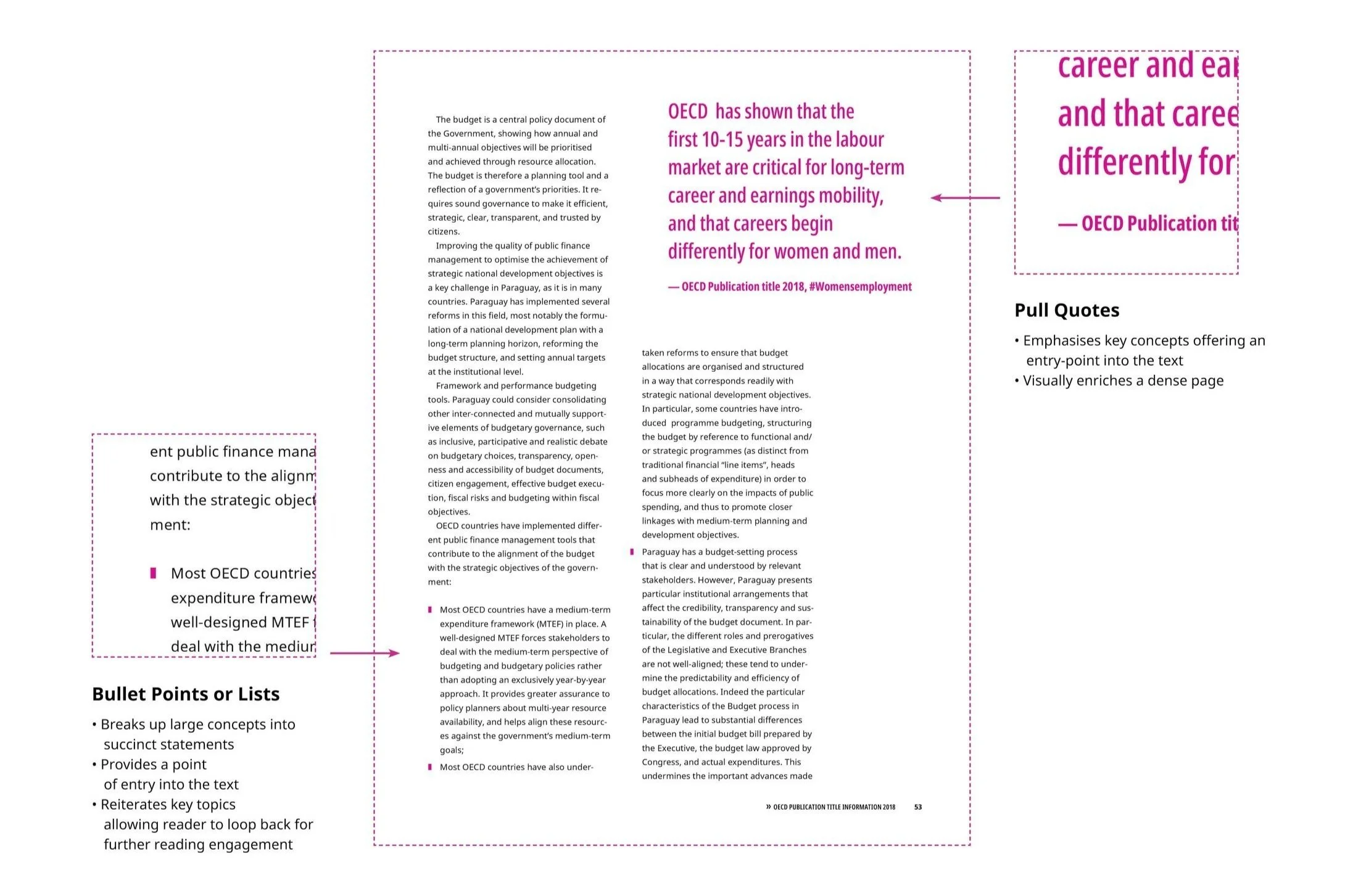
Pull quotes
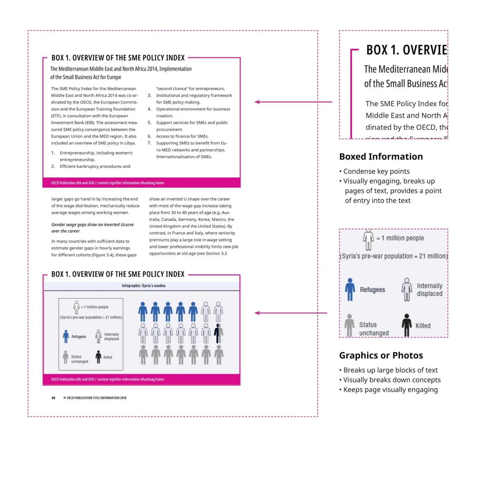
Boxed information
Graphics or photos
Headings
Lists
Tools You Can Use
Authors, Editors, and Designers can deploy the features listed below along with other tools like Plain Language to make reading dense content easier, faster, and more gratifying for their readers. None of us can do this on our own. Designers need the content to be developed for points of entry, Editors need Authors to be open to this approach, and Authors must understand the risk of not meeting their readers halfway (not being read, cited, and therefore not influencing the conversation).
Use headlines, subheadings, and pull quotes to break up the text and allow the reader to find items of interest. This will encourage them to loop back and dive deeper into the content.
Lists, abstracts, and boxes simplify information and assist readers in quickly understanding the main points of the content, which in turn may prompt them to engage further with the text.
Incorporate visuals and graphics to support and break up the text. This can help to illustrate complex ideas, offer visual pauses, and make the content more engaging.
Use a clear and easy-to-read font that is comfortable for the eyes. Small text or difficult-to-read fonts can strain the eyes and make reading less enjoyable.
Make sure that the content is organized in a logical and coherent way. This will make it easier for readers to follow the flow of the text and understand the key takeaways.
A priority should be to make reading more accessible and engaging. Through the development of wayfinding graphics, boxes, pull quotes, and visual pauses, content becomes easier for readers to navigate — permitting them to “snack” on information, skimming and circling back as needed.
What exactly does that mean?
Imagine you receive a book, report, or paper for work and you need to read and digest the material quickly for an upcoming meeting. You look at the document and see it is long — at least 60 pages — and as you flip it open you are greeted by pages upon pages of black text. It is an ocean of content that is washing over you like an unexpected wave as you stand on the beach.
Your heart sinks. You start skimming, moving your eyes in search of a welcoming point of entry; something that catches your eye to make you stop and consider, “is this information relevant to me and is it worth my time?”
The above examples are based on the work we did for The Organization for Economic Co-operation and Development (OECD) when we developed text and layout systems for their premier publications. We go into even more detail in the case study. See the case study here!
Let’s talk more about Creating Accessible and Engaging Layouts.